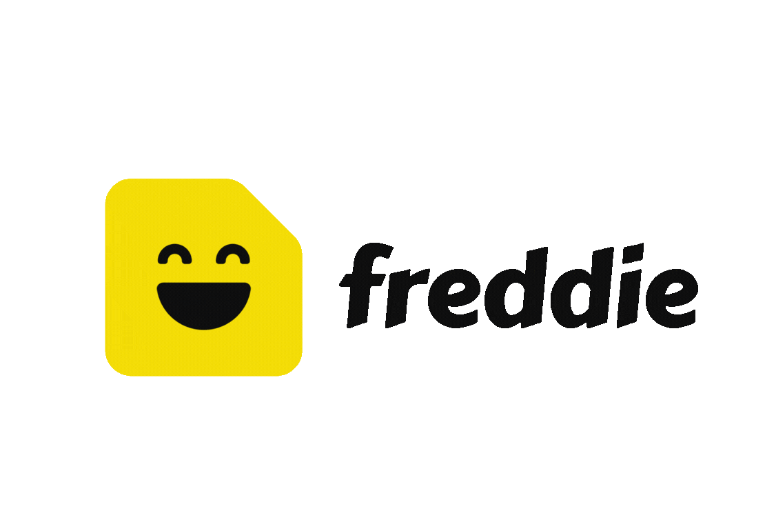
Freddie
Turns contact lists into real connections, with smart reminders & personal notes to keep relationships strong.
company
Beshi
role
Product Designer
Timeline
8 Weeks
COllaborators
Product Manager, Developer
About Freddie
Freddie is a mobile personal CRM built for individuals who want to maintain meaningful relationships with ease. Designed as a B2C product, it supports connection through timely reminders and thoughtful context. I was responsible for the full design lifecycle, collaborating closely with a developer. The app is set to launch soon on both iOS and Android platforms.
Opportunity
The product aims to fill the gap left by standard contact lists on iOS and Android, as well as professional platforms like LinkedIn, by offering a more intentional, relationship-centered approach to staying in touch. It focuses on personal connection, not just contact storage or professional networking.
My Role
Led the end-to-end design process, and worked closely with a developer to bring the concept to life for both iOS and Android platforms.
Product Mission
Help individuals build and maintain meaningful personal connections, without relying on memory or cluttering calendars.
Target Users
01 Individuals who want to stay in touch more intentionally.
02 Busy professionals, parents, or socially active users who often forget to reach out.
03 Those looking for a smarter, more personal way to manage connections, beyond what the default phone contact list provides.
Finding The Gap
A benchmark analysis of iOS, Android, and LinkedIn contact tools to identify commonalities, unmet user needs and opportunities.

Comparison & Research
Explored the options in each operating system to learn the baseline and identify low hanging fruits.
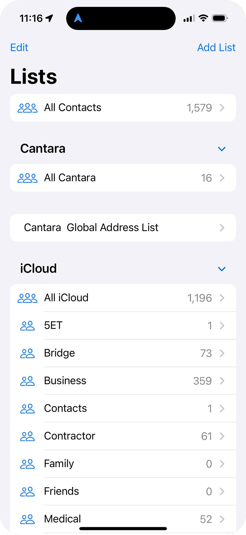
iOS contact list groups
Android (Google Pixel) contact list reminders

Key Features
Contact Import & Sync
Pull contact data from phone with user permission
Reminders
Set custom or smart prompts to reach out to specific people
Notes Section
Store relationship context (birthdays, last chat, shared history, etc.)
Suggested Messages
Curated reach-out suggestions based on contact context
Notifications
Gentle nudges to reach out without being overwhelming
Privacy & Data Ethics
Clear language around data ownership and storage
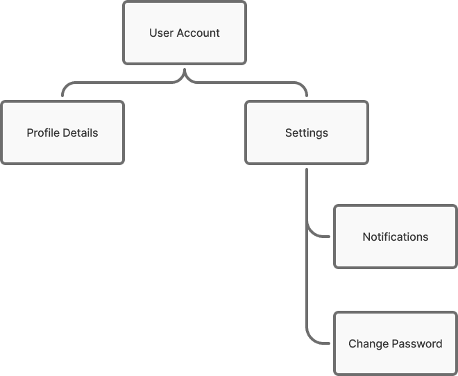
App Structure
Starting with a clear layout to understand user flow, feature placement, and how the app can scale over time.


Branding & Tone
Freddie’s branding is designed to feel warm, personal, and approachable, helping users feel supported, not overwhelmed. The tone balances friendliness with simplicity, keeping interactions light while emphasizing meaningful connection.

We intentionally moved away from the formal, work-driven feel of traditional B2B CRMs, aiming instead for a more personal, inviting experience, something users would genuinely enjoy engaging with. Every detail, from color choices to microcopy, reinforces the idea that staying in touch should feel natural, thoughtful, and easy.
Here are the core values that helped us define Freddie, from branding, tone, microcopy and design:
01 Personal Connections
Design every interaction to feel human, relatable, and meaningful, not transactional. Prioritized features like notes and thoughtful reminders to help users nurture relationships, not just manage contacts.
02 Simplicity
Keep the experience intuitive, lightweight and straight forward. Focused on creating a clean user flow with minimal steps to set reminders, view notes, or send messages, so staying in touch feels effortless rather than like managing a task list.
03 Friendly, Inviting Tone
Craft the brand voice and visual language to feel warm, approachable, and non-corporate. Every touchpoint, from colors to microcopy, was designed to encourage engagement without feeling like work or another productivity app.
04 Proactive
Help users stay connected with timely, thoughtful nudges, without overwhelming them or cluttering their calendars. Reminders and suggestions are designed as gentle support, giving users control over their connections rather than adding pressure to their day.
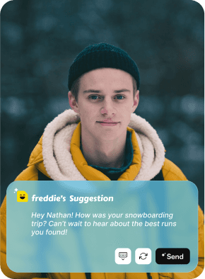
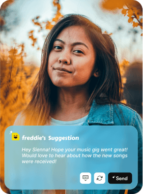
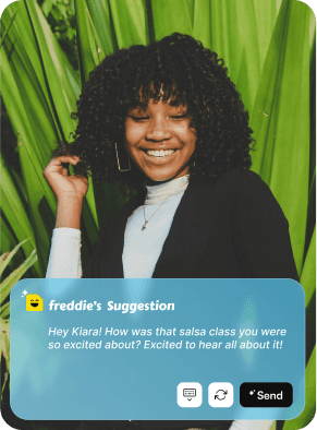
Freddie's Suggestion
Freddie’s suggestion offers personalized message ideas based on your relationship notes history, making it easier to reach out thoughtfully without overthinking what to say.

Who is Freddie?
Freddie’s branding brings the sticky note to life, friendly, simple, and human. With a bright color and a smile, Freddie turns reminders into personal moments, not chores.
Near Launch Deliverables
Over the course of 8 weeks, I led the end-to-end design of Freddie, from product definition and flows to a fully polished UI. The app is now 95% production-ready, with most UX and UI work complete (with small tweaks that are WIP). We’re currently fine-tuning the final details, debugging edge cases, and preparing for launch across iOS and Android. The following screens were taken from the production version of the app.
Intro Slider & Splash Screen
A simple, friendly intro slider that highlights Freddie’s core features and tone, designed to set the stage without overwhelming new users.

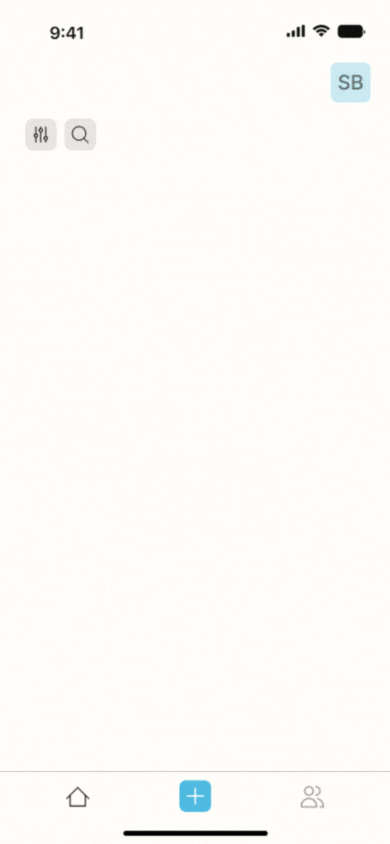
Home Page
Freddie’s home screen is designed with one purpose in mind: helping you reach out. By showing only reminders, no clutter, no distractions, it keeps connection front and center. And with Freddie’s suggestion feature offering what to say, you can stop overthinking and start reaching out with ease.
Adding a Reminder
Creating a reminder in Freddie is quick, accessible, and designed to eliminate friction. Users can add a reminder from anywhere in the app via the menu bar, making it easy to capture the intent to reach out in the moment. For even more context, reminders can also be added directly from a contact’s page, no need to reselect the person, ensuring the action stays focused and quick.
Contact Profile Page
The contact profile page offers a full snapshot of your relationship, including an AI-generated summary based on notes, reminders, and details from the About tab. A timeline shows past and upcoming interactions, while quick actions let you add a note or set a reminder directly. Freddie’s suggestion feature is also integrated, making it easy to reach out without overthinking.
Newsletter
The daily reminder email is designed to surface what matters most, users’ next action. Even without logging into the app, recipients can view who’s on their radar and follow up directly. To keep the experience engaging, each email ends with a rotating motivational message that changes regularly. This small touch adds personality, encourages scrolling to the bottom, and keeps the interaction feeling personal and fun.

What's Next for Freddie?
Attachment tab
Within each contact’s profile, users will be able to view all files, photos, and links associated with that contact. This will centralize shared context and make it easier to refer back to important information.
Calendar View
A separate calendar screen will provide a timeline view of all upcoming reminders. This feature is intentionally placed outside the home screen to preserve its clean, task-focused experience.
QR Code Sharing
To simplify adding new contacts, users will be able to scan a unique Freddie QR code, similar to LinkedIn’s QR feature. This will allow for quicker in-person exchanges without manually entering details.